by Gary Alexander
March 24, 2026
With wars and inflation, why is gold lower? Short answer: Gold is only lower short-term, as the Fed looks like they will keep rates high, and algorithmic traders say this hurts gold and stocks, but anything can change at any time, for patient investors. To wit, we’ve seen three-gold “buys on dips” since October:
- On October 20, 2025, gold peaked at $4,336 and fell 8.5% to $3,966 a week later before soaring to $5,000.
- On January 29, 2026, gold fell 13%, from $5,318 to $4,622 in three-days, but then soared back to $5,294.
- On March 2, 2026, gold fell 15%, from $5,294 to $4,482 last Friday, a third buying window in five-months.
The Wall Street Journal prefers shorter-term views, writing on Friday (in “Sell-off in Precious Metals Accelerates”) about gold and silver’s “worst daily declines on record Thursday,” but certainly not the worst declines – like the 80% drop in silver and -50% gold in three-months in early 1980. They also failed to mention the two examples (above) of savvy investors buying on dips rather than chasing new highs.
The Journal was on the right track citing prior expectations of two rate-cuts, now reduced to one, as a likely cause: “Traders saw a similar dynamic play out in 2022, when Russia’s invasion of Ukraine led to a surge in energy prices, fanning inflation. Gold fell for seven-straight months between April and October.”
Our compatriot here, Bryan Perry, has a more accurate analysis, in my view, as he and I recall the Black Monday stock sell-off in October 1987 leading to a gold stock massacre the next day, “Bloody Tuesday.”
This week, Bryan wrote:
“Last week, investors saw a rare phenomenon: Gold and equities both sold-off sharply, together. This usually means large hedge funds have to meet major margin calls, so they are forced to sell their winners (like gold) to cover losses in their losers (like technology stocks or small-caps).”
Looking at any market over a two-day, two-week, or even two-month period is, to me, fairly senseless (and exhausting). I’ve been a “gold bug” (favoring gold over the dollar) since my 1960s college days, when my dad was in a gold-oriented investment club and sent me all his “hard money” newsletters, but my first journalistic offering in that field was an 8-page article for a major international magazine in October 1971, “America Faces the Dollar Crisis,” following Nixon’s August closing of the gold window.
My opening paragraph back then put the crisis in perspective: “The American dollar reigned supreme in world trade and finance,” until 1968, when “claims on U.S. gold were running into the millions of dollars per-day. More than $12-billion (half) of U.S. gold was drained between 1958 and 1968, and much of that came in the last hectic months before March 1968, when the U.S. temporarily closed the gold window.”
In the 1970s, I joined the “hard money movement, and in the 1980s, I edited Jim Blanchard’s “Gold Newsletter.” Since then, I have also authored a weekly gold newsletter for 20-years now, since 2005.
That said, being a gold bug often demands long-term patience – for two decades, 1980 to 2000. While the mainstream press blows hot and cold on gold, making them late in identifying trends and prone to focus on gold’s flaws, I see a lot of golden nonsense printed on all sides. Lately, on March 2, The Wall Street Journal printed a chart showing gold badly under-performing both the S&P 500 and Warren Buffett’s Berkshire Hathaway since 2011, defending Buffett’s broadside against gold in his 2011 shareholder letter.
Bear in mind – I like stocks more than gold, and we have built our net worth mostly in stocks, with gold as a dollar hedge. I have owned Buffett’s Berkshire shares for 20+ years and am pleased with the results, but that doesn’t mean Warren Buffett knows enough about gold to bash its major role as a dollar hedge.
As a long-time (nearly 60-year) gold bug, I am familiar with all the arguments – both ways – and I still don’t see any reason for a war here. Both gold and stocks are vital portions of any portfolio, with stocks claiming the majority position and leadership role. Gold is more of a currency hedge than a stock market hedge, but it so happens gold has beaten most market indexes over most holding periods since the 1960s.
Whenever I see some fan of stocks try to bash gold, I see they invariably show gold charts starting during a gold bubble peak – either that single-day in January 1980 when gold hit $850, or the $1,900 peak in 2011, both following 10-year surges and peaking in a buying frenzy. Gold bugs tend to do the same thing, starting their charts at a market peak, like 2000, when gold was low. I’ve devised a formula for this craft:
If you want a dazzling CHART,
Let me choose the date to START…
Or if you want to prove a TREND,
Let me choose the date to END.
There’s an old axiom (“charts don’t lie”), but biased advocates use charts all the time to warp results in their favor. Disraeli (British statesman and former prime minister of the U.K.) reportedly said, “There are three-types of lies: Lies, damned lies, and statistics.”
The March 2 Journal article starts out saying, “If they gave out medals in financial trash talking, Warren Buffett would be on the podium. He’d probably ask for cash in lieu of a metal disk.” That’s a clever quip, but presumptuous, since the winner’s “metal disk” in the Olympics is Gold – so, who would prefer paper?
The article goes on to say Buffett quipped that gold “gets dug out of the ground in Africa, or someplace. Then we melt it down, dig another hole, bury it again and pay people to stand around guarding it. It has no utility.” But Buffett uttered that quote in a speech at Harvard in 1998, and if you chart gold vs. stocks since 1998, instead of 1980 or 2011 (in the Journal review), gold is the clear winner. Gold’s average price in 1998 was $294, so even with its recent correction to $4,500, it is up 1430%, while the S&P 500 is up about one-third as much, +480, but invariably, anti-gold writers prefer starting gold charts in early 1980.
Gold has beaten every historic currency over time. Most past currencies were inflated out of existence. Of those which remain, all are off 90% or more to gold in our adult lifetimes, since the 1960s. Gold is up 140-fold vs. the U.S. dollar since 1971, so today’s dollar is worth less than a 1971 penny, in gold terms.
Why Gold Has Soared Since 2000 – and Especially Since 2020
When measured against paper currencies, gold has had some long slumbers. The dollar out-performed gold for most of the 1980s, but that was a time of strong market growth, a strong dollar and strong American global leadership. This winning streak continued for most of the 1990s – but then came Y2k and 9-11.
In looking back to the dawn of this century, the first thing to address is our national myopia. We survived Y2k and the “dot com” bomb in 2000, so our leaders figured it would be smooth sailing from Year 1 on, but the 9-11 crisis caused two-decades of seemingly paranoid and endless “wars against terror,” including high-security regulations at home, but before the 9-11 attack, we enjoyed a budget surplus winning streak.
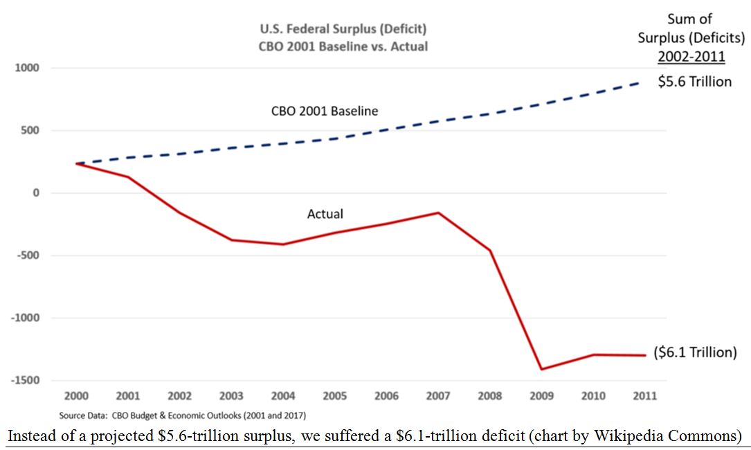
For four-consecutive fiscal years, 1998-2001, we ran a federal budget surplus, with both Parties joining forces to share the credit – President Clinton and his Republican-controlled Congress. Then, in 2001, the non-partisan Congressional Budget Office (CBO) predicted (in January) this winning streak would go on forever and we would pay off the entire national debt within a decade, by 2011. Specifically, the CBO’s early 2001 report projected a cumulative surplus of $5.6-trillion for the decade from 2001 to 2011.
Instead, deficits in that 10-year period reached $6.1-trillion, a negative swing of $11.7-trillion. They failed to anticipate those three-Black Swans flying into the World Trade Center and Pentagon, and the bloated costs of Bush’s “War on Terror” after September 11, 2001, resulting in 20-year wars in Afghanistan and Iraq, then a real estate bubble, followed by bloated TARP bailouts to save big banks. From the CBO’s document, “” here is their guess, and miss:
Graphs are for illustrative and discussion purposes only. Please read important disclosures at the end of this commentary.
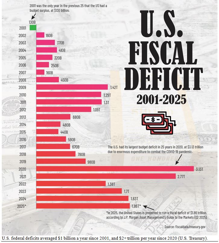
All that is pretty much ancient history by now, but the endless wars, the Fed’s panicky reaction to 2008 (with zero-interest rates for the following eight-years – effectively, the entire 8-year Obama presidency) led to massive deficits from the end of that crisis until today, especially in the post-COVID years.
These massive debts clearly demonstrate the major cause of gold’s 18-fold rise since 2001. I posted this chart in January, but I want to post it again as a single-shot graphic on why gold has soared since 2000:
Graphs are for illustrative and discussion purposes only. Please read important disclosures at the end of this commentary.
That’s why I start my own gold history charts in 2000, when our world was turned upside-down and huge deficits returned with a vengeance. Here is my own chart of gold vs. stocks, from our weekly gold letter:
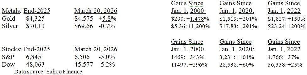
Gold is the clear winner so far this year, and since Y2k, out-gaining the S&P 500 by 4-to-1, +1,478% vs. +343%, while silver is a more recent winner, since 2020 (3-fold over stocks) or 2022 (a 5-fold edge).
I realize I am cherry-picking some of these dates, but I have a lot of other dates I could use to show gold’s superior gains, and the anti-gold crowd keep hawking charts starting in either 1980 or 2011. I just wish other chart-makers would also admit they choose their starting dates and ending dates to prove their case.
Navellier & Associates; do not own Berkshire Hathaway (BRK/A), in managed accounts. Gary Alexander does personally own Berkshire Hathaway (BRK/A).